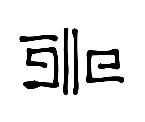
While designing for the Spring '13 collection for Mata Traders, we noticed a trend in simple geometric shapes and clean lines. I suddenly remembered a book I own on traditional Korean pattern design and the more I thought about it, the more I believed we could use some of the designs for the collection. These patterns are so traditional and incorporated in Korean design & culture, that it makes it possible for us to use without needing copyrights or licensing!
The great thing about Korean pattern designs is that they are extremely simple and feel very modern. After combing through the book multiple times, we had to narrow our list down to 3 patterns to work with. Here they are in their original designs.
Once we selected these 3 patterns, we began to play with color. By doing this, we automatically changed the whole appearance and vibe of the prints. These designs are traditionally in black & white or at least in just two colors. We used one print in it's original state but also gave all 3 prints a contemporary feel by using the bold & bright colors in our color story for Spring '13.
Korean Dots Print. Textile design by Shifra Whiteman. Garments by Mata Traders.
Let's start with the Korean Dots print. Here we created 2 different color variations for 3 garments. On the left, we worked with a bright pink and dark blue color combination (on the Garden Party Dress Polka Dot), giving the print a playful edge. On the right, we reversed the black and white from the original print, which sometimes plays tricks on my eyes (used on the Obi Crescent Dress Black and Yin Yoke Skirt Black). You might notice that both prints, look slightly different aside from their color. That is because the print on the right is a block print and needed slightly thicker lines in between each dot, while the print on the left is a screen print and can have daintier lines.
Korean Blocks print. Textile design by Shifra Whiteman. Dresses by Mata Traders.
This Korean Block print is a block print that we decided to use both the original print as well as a colorful version. The original black and white is used in the Shibuya Dress and is paired with the monochromatic block printed Korean Dots print. The blue and green version is used in the Obi Crescent Dress Blue. This use of both colors incorporates the white of the fabric and really makes the dress pop. Both dresses have hand stitch details that really add the special element of hand crafting to the garments.
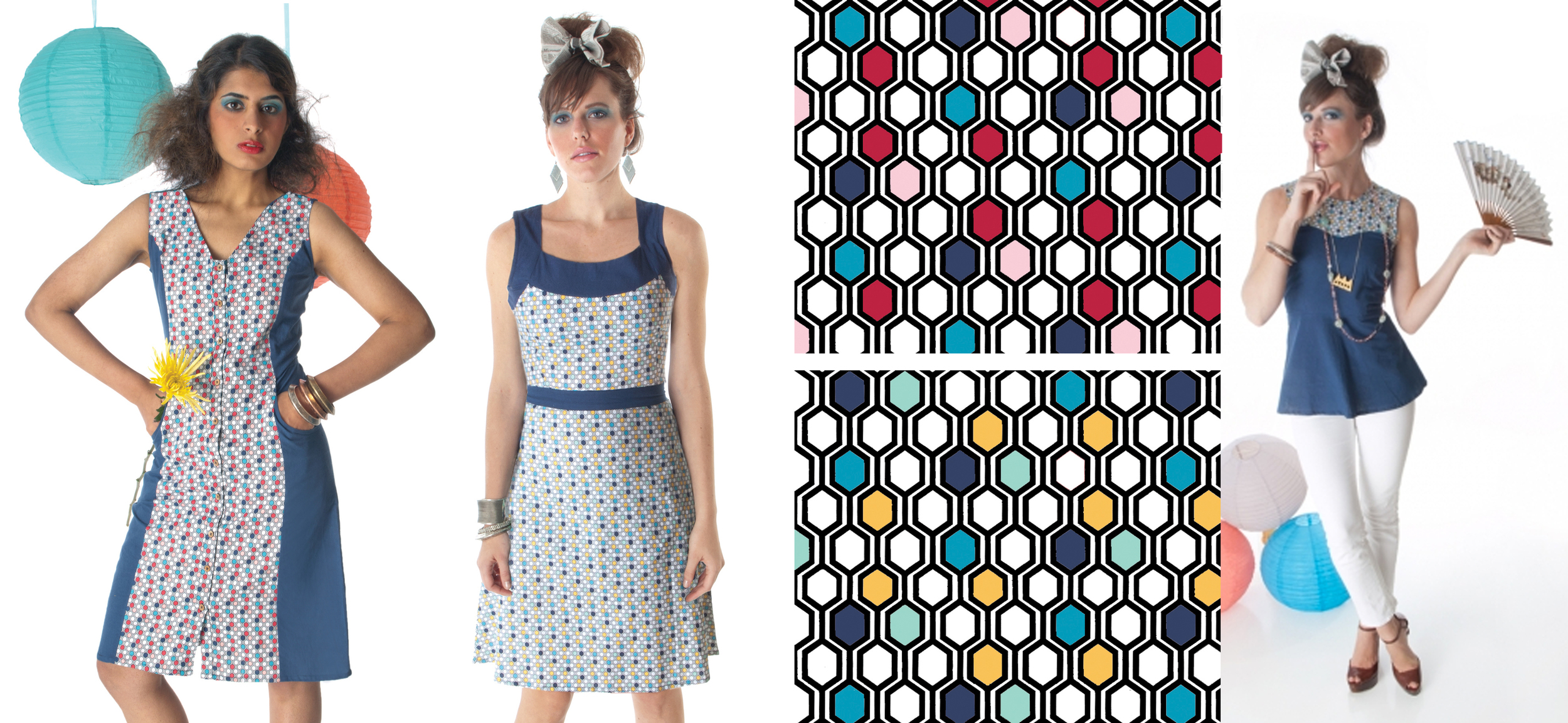
Korean Hexagon Gone print. Textile design by Shifra Whiteman. Garments by Mata Traders.
The Hexagon Gone print was my personal favorite to work on. Playing with placement of colors, and so many of them, was a thrill. Here we have 2 versions of the Hexagon Gone print, and they really do transform the feel of the garments from simple and traditional to vibrant and playful. There is a slight edge to each garment (on the left Kyoto Color Block Dress Blue, middle is the Tea and Honeycomb Dress and on the right is the Singapore Sweetheart Top Blue). These products can be found at Mata Traders and the majority of these garments are on sale.
These prints are a wonderful example of modernizing traditional styles and elements with color. I hope to be inspired and possible use more Korean patterns in the future because I believe these really did turn out great.


